


User Experience Project
This project was developed as the capstone for my Master's in UX Design. The goal was to explore feature enhancements for Keynote, empowering users to effortlessly create well-designed decks. Spanning two eight-week courses, the project followed a structured process to reimagine the interface and integrate AI capabilities, making professional-quality design accessible to everyone.
Phase 1: Focused on defining the problem and conducting comprehensive desk and user research to uncover key insights.
Phase 2: Emphasized developing and refining a functional prototype to address user needs and test potential solutions.
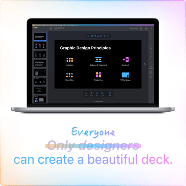
Apple Intelligence is poised to become a transformative catalyst for personal productivity. At the 2024 WWDC (World Wide Developer Conference), Apple showcased how Generative AI could revolutionize workflows by creating images from prompts and summarizing large amounts of text.
Foundation models hold the potential to redefine the design process, providing tools that streamline and simplify presentation creation. This project aimed to empower all Keynote users—not just designers—to express their ideas and pitch their concepts effectively. By addressing design challenges, my goal was to enable users to focus on their message and storytelling.
In the corporate world, presentations are essential for sharing ideas, reporting progress, and gathering feedback for iteration.
Keynote's current interface lacks features that streamline workflows, making it difficult for users to apply professional design principles efficiently.
Dig deeper into the Scholarly Research and Competitive Analysis
To better understand the problem, I conducted a survey with 10 participants who had used presentation software within the past three months. The goal was to gather insights into their software preferences, proficiency levels, comfort with design principles, and openness to integrating Generative AI into their workflows.
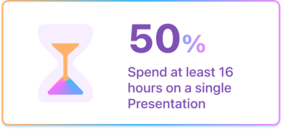
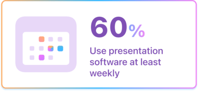
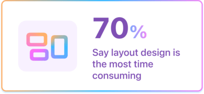
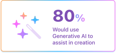
The surevey results revealed pain points associated with using presentation software, and validated an openness to utlizing AI to streamline the process:
Dig deeper into the Survey Results
Building on the survey findings, I conducted in-depth interviews with six corporate professionals who had used Keynote within the past month. These interviews delved into their workflows, pain points, and goals, offering valuable insights into how Keynote supports their presentation creation process.
Layout & Design
Assets
Collaboration
Text
Dig deeper into the Interview Field Guide and User Research Findings
From user research, I identified three archetypes that represent distinct workflows, expertise levels, and use cases. These personas guided the design process, ensuring the solution effectively addressed a diverse range of user needs and scenarios.
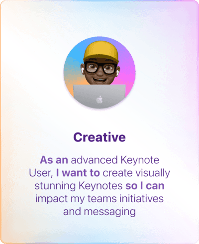
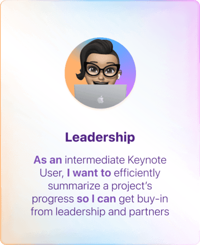
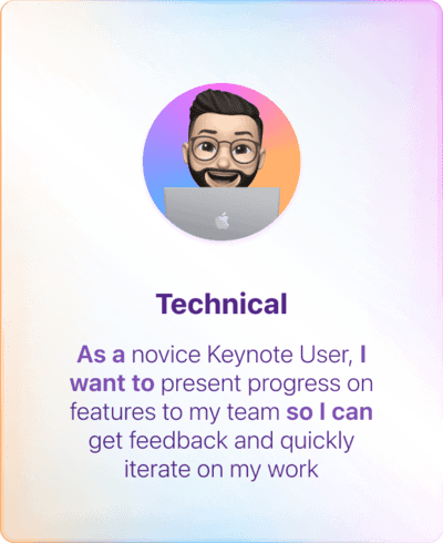
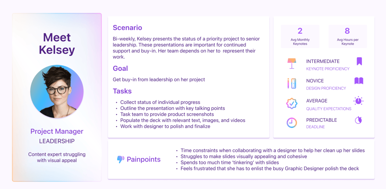
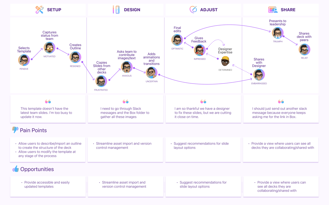
I created User Personas for each archetype and mapped their journeys using Keynote to uncover key areas of opportunity.
For this case study, I am highlighting Kelsey, the “Leadership Professional” persona. Kelsey represents a user with strong content creation skills but has a need for design assistance. Their journey map reveals critical pain points and opportunities, offering insights into how the solution can empower them to craft impactful presentations.
Dig deeper into the User Archetypes and User Personas
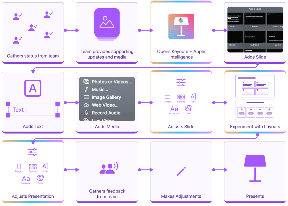
Using the pain points and opportunities from the user journeys, I designed streamlined workflows for each user archetype, adding features to alleviate their frustration areas.
For the Leadership Professional, the updated interface eliminates the need for back-and-forth collaboration with a designer, empowering Kelsey to confidently create polished decks on her own with a feature that recommends layouts based on her content.
With design challenges minimized, feedback now centers on refining the presentation's message rather than critiquing slide aesthetics.
Dig deeper into the User Flows
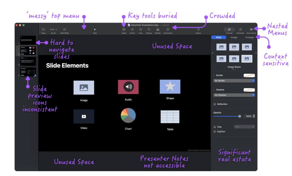
To ensure my new features felt native to Keynote, I performed a usability analysis of Keynote, applying Nielsen Norman Groups 10 Usability Heuristics to pinpoint areas of friction and uncover opportunities for improvement.
I focused on slide design and feature accessibility, identifying that while the minimal interface promotes simplicity, it disrupts efficiency, and the available screen real estate could be better utilized to support key workflows.
Dig deeper into the Heuristic Evaluation
Based off the findings from the Heuristic Evaluation, I sketched a reimagined interface, focusing on streamlining key workflows and intuitive placement of new AI features. Instead of merely layering these features onto the existing UI, I aimed to seamlessly integrate them into the workflow, enhancing usability while preserving a cohesive design.
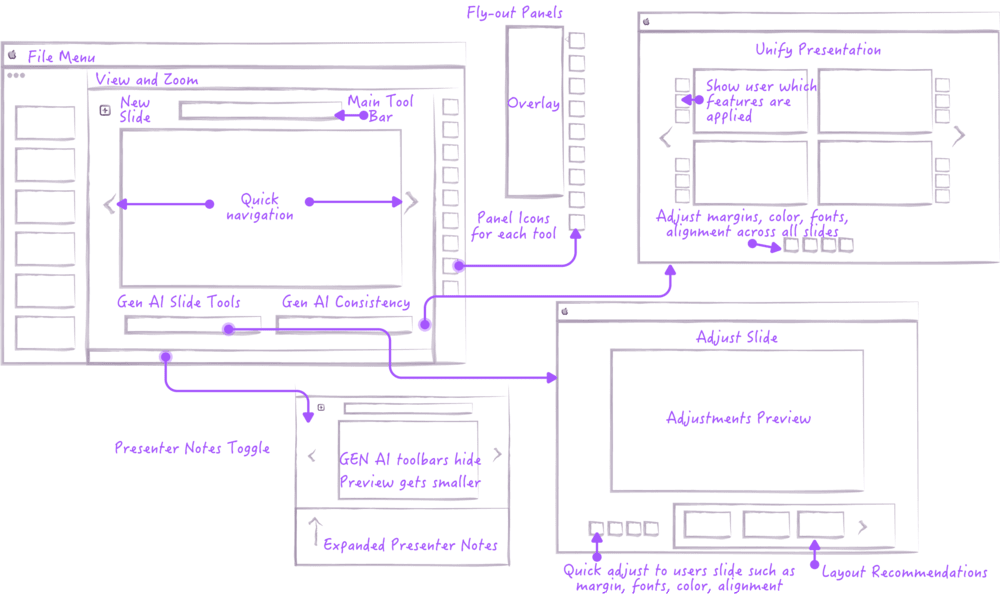
Dig deeper into the Sketches
I developed an abstract version of the interface to keep the focus on workflows and feature utility rather than the Keynote interface. The prototype highlighted a reimagined UI and the integration of new AI features. Testing involved 20-minute in-person sessions with 5 participants, each representing one of the identified user archetypes.
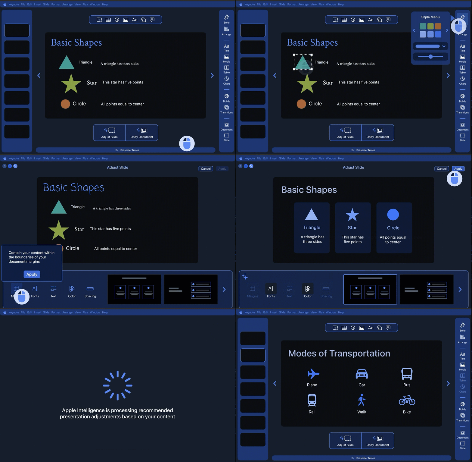
Dig deeper into the Mid-Fidelity Prototype
The Good
Room For Improvement
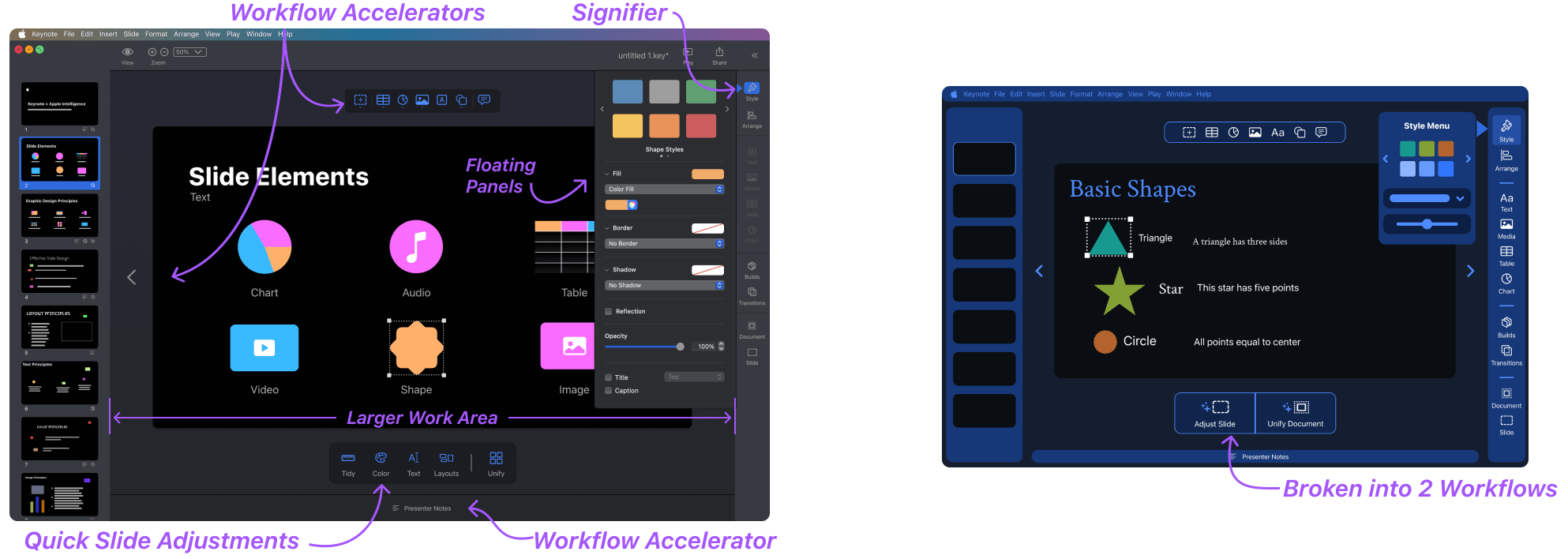
I incorporated the insights gained from the Heuristic Evaluation and Mid-Fidelity prototype testing into the High-Fidelity Prototype:
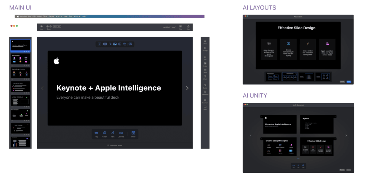
Main UI
Streamlined workflows and maximized workspace.
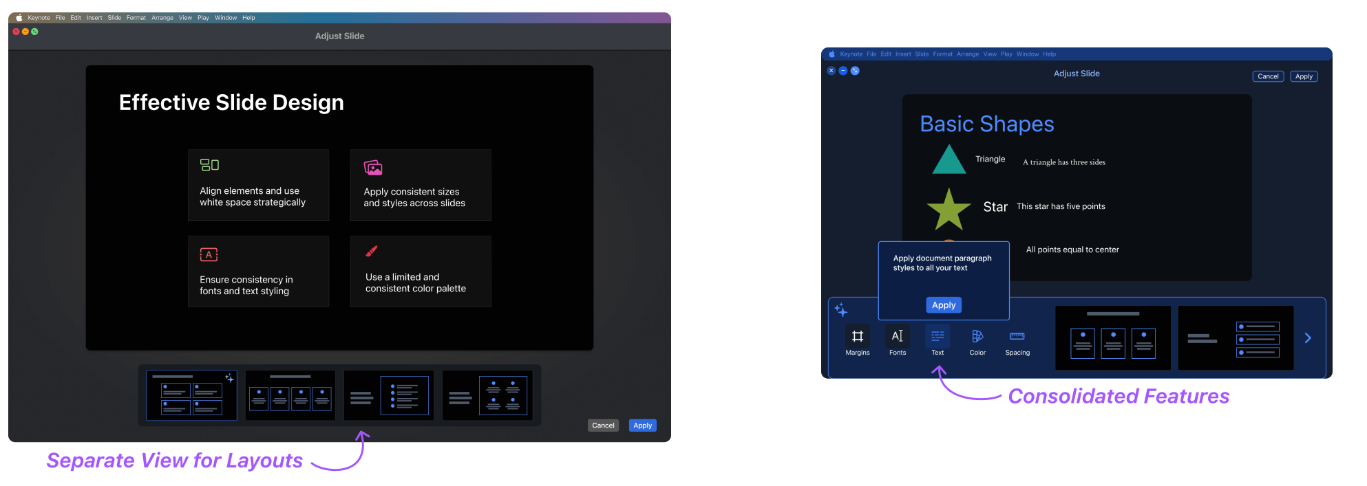
Slide Recommendations
Slide level adjustments consolidated and separated into 2 workflows.
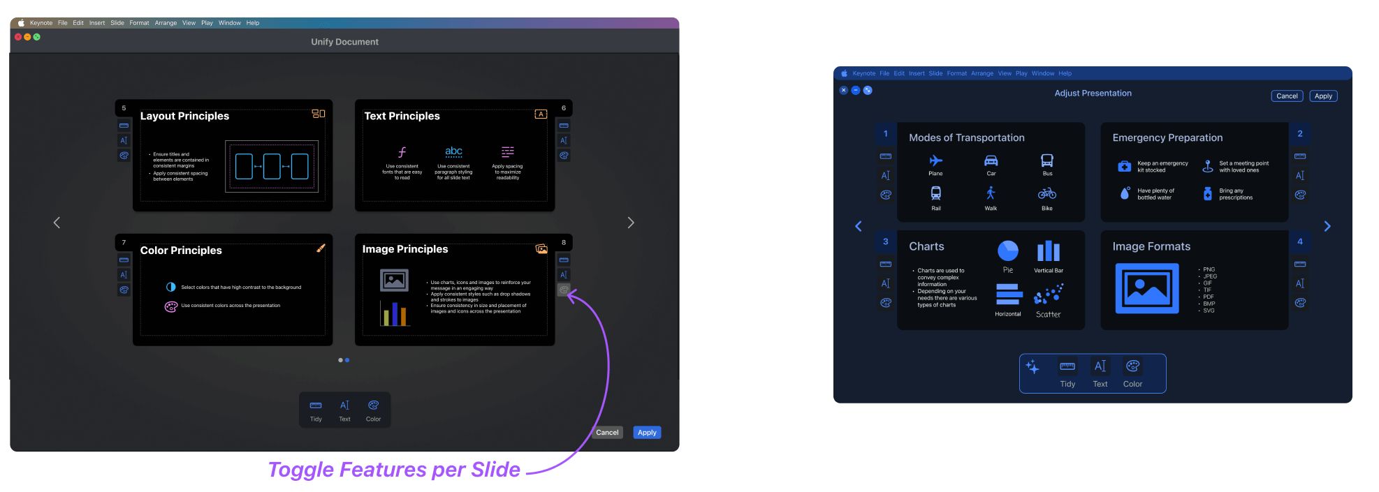
Unify Presentation
Control for users to toggle features at a slide level.
Dig deeper into the Usability Study Results
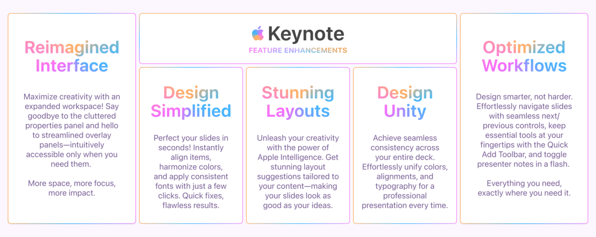
The high-fidelity prototype, built in Figma, showcases the updated interface and AI features designed to make professional presentation design accessible and efficient for all users:


Dig deeper into the Design System