Keynote + Apple Intelligence
User Experience Project

This project was developed as the capstone for my Master's in UX Design. The goal was to explore feature enhancements for Keynote, empowering users to effortlessly create well-designed decks. Spanning two eight-week courses, the project followed a structured process to reimagine the interface and integrate AI capabilities, making professional-quality design accessible to everyone.
Project Overview
Generative AI has the potential to redefine the design process, providing tools that streamline and simplify presentation creation. This project aimed to empower all Keynote users—not just designers—to express their ideas and pitch their concepts effectively. By addressing design challenges, my goal was to enable users to focus on their message and storytelling.
Defining the Problem
In the corporate world, presentations are essential for sharing ideas, reporting progress, and gathering feedback for iteration.
-
Non-designers often face challenges creating visually compelling presentations due to limited design expertise, tight deadlines, and the complexity of existing tools
-
Designers are burdened with repetitive manual tasks that take away from more creative, high-impact design work
Keynote's current interface lacks features that streamline workflows, making it difficult for users to apply professional design principles efficiently.
Sometimes I think my team doesn't take my work seriously because of the way my deck looks.
~Michael, Software Engineer
Prototype
Exploring the Problem
Survey
To better understand the problem, I conducted a survey with 10 participants who had used presentation software within the past three months. The goal was to gather insights into their software preferences, proficiency levels, comfort with design principles, and openness to integrating Generative AI into their workflows.
The survey results revealed pain points associated with using presentation software, and validated an openness to utilizing AI to streamline the process:

50%
Spend at least 16 hours on a single Presentation

60%
Use presentation software at least weekly

70%
Say layout design is the most time consuming

80%
Would use AI to assist creation
Interviews
Building on the survey findings, I conducted in-depth interviews with six corporate professionals who had used Keynote within the past month. These interviews delved into their workflows, pain points, and goals, offering valuable insights into how Keynote supports their presentation creation process.
Layout
-
Users spend a lot of time adjusting the layout of slides
-
The process of adjusting slide layout is very manual
-
Users struggle to understand what makes a visually appealing layout
Assets
-
Creating templates with brand guidelines is time consuming
Users struggle to locate the latest template
Teams struggle to reuse common assets
Collaboration
Cloud permissions are hard to manage
3rd party file sharing solutions are commonly used
Users have to download/open to preview and edit
Text
-
Users utilize outside software to structure and organize the Keynote
-
Users struggle with summarizing or minimizing text on the slide
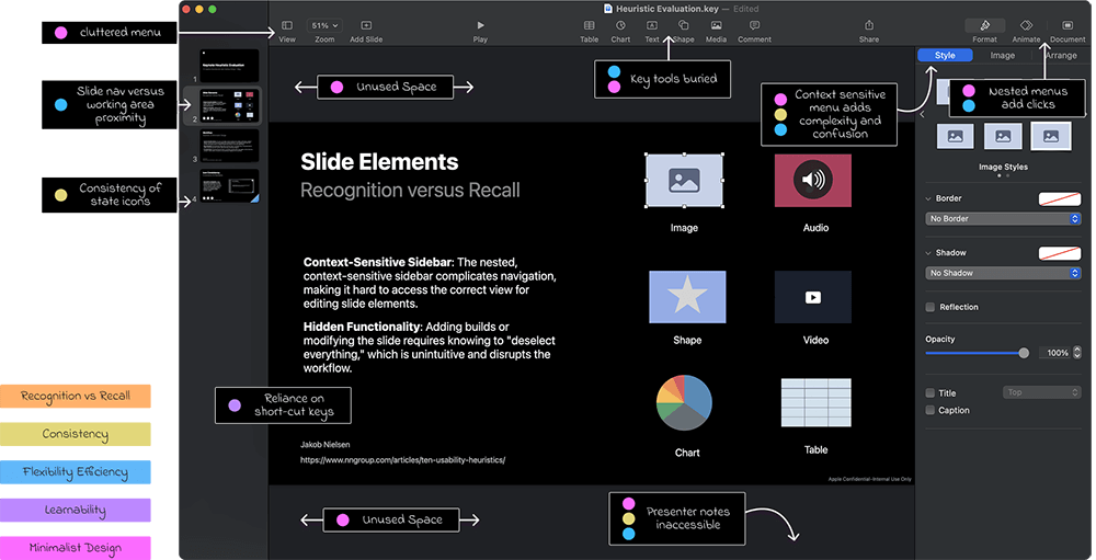
Heuristic Evaluation
To ensure my new features felt native to Keynote, I performed a usability analysis of Keynote, applying Nielsen Norman Groups 10 Usability Heuristics to pinpoint areas of friction and uncover opportunities for improvement.
I focused on slide design and feature accessibility, identifying that while the minimal interface promotes simplicity, it disrupts efficiency, and the available screen real estate could be better utilized to support key workflows.
Target Audience
Archetypes
From user research, I identified three archetypes that represent distinct workflows, expertise levels, and use cases. These personas guided the design process, ensuring the solution effectively addressed a diverse range of user needs and scenarios.

Creative
As an advanced Keynote User, I want to create visually stunning Keynotes so I can make an impact on my teams initiatives

Leadership
As an intermediate Keynote User, I want to efficiently summarize a project's progress so I can get buy-in from leadership and partners

Technical
As a novice Keynote User, I want to present progress on my work to my team so I can get feedback and quickly iterate
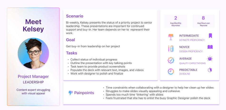
User Persona & Journey Map
I created User Personas for each archetype and mapped their journeys using Keynote to uncover key areas of opportunity.
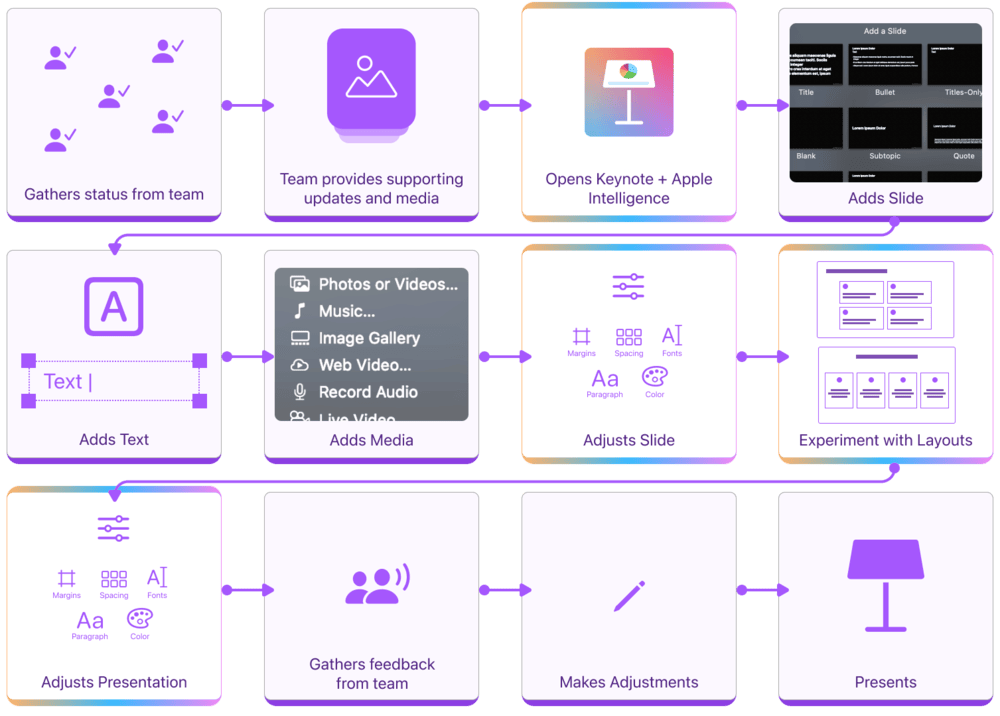
For this case study, I am highlighting Kelsey, the “Leadership Professional” persona. Kelsey represents a user with strong content creation skills but has a need for design assistance. Their journey map reveals critical pain points and opportunities, offering insights into how the solution can empower them to craft impactful presentations.
Ideation
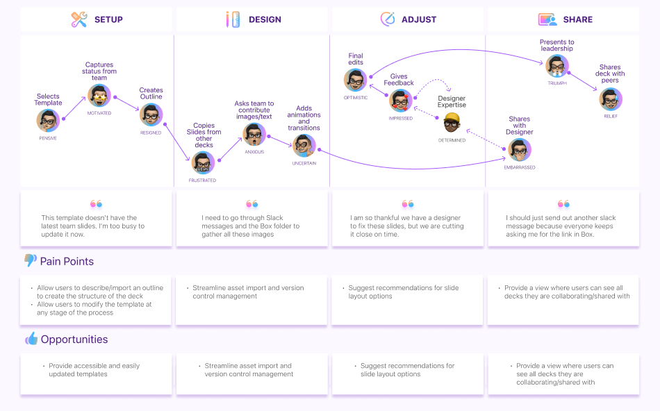
User Flow
Using the pain points and opportunities from the user journeys, I designed streamlined workflows for each user archetype, adding features to alleviate their frustration areas.
For the Leadership Professional, the updated interface eliminates the need for back-and-forth collaboration with a designer, empowering Kelsey to confidently create polished decks on her own with a feature that recommends layouts based on her content.
Sketches
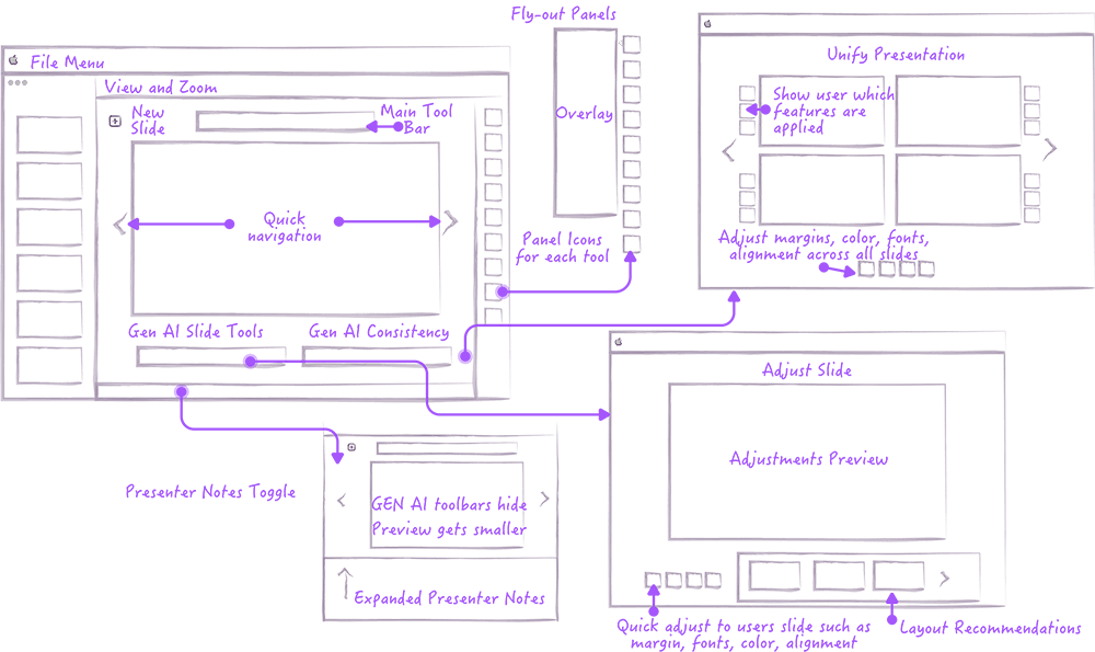
Based off the findings from the Heuristic Evaluation, I sketched a reimagined interface, focusing on streamlining key workflows and intuitive placement of new AI features. Instead of merely layering these features onto the existing UI, I aimed to seamlessly integrate them into the workflow, enhancing usability while preserving a cohesive design.
User Testing
Medium Fidelity Prototype
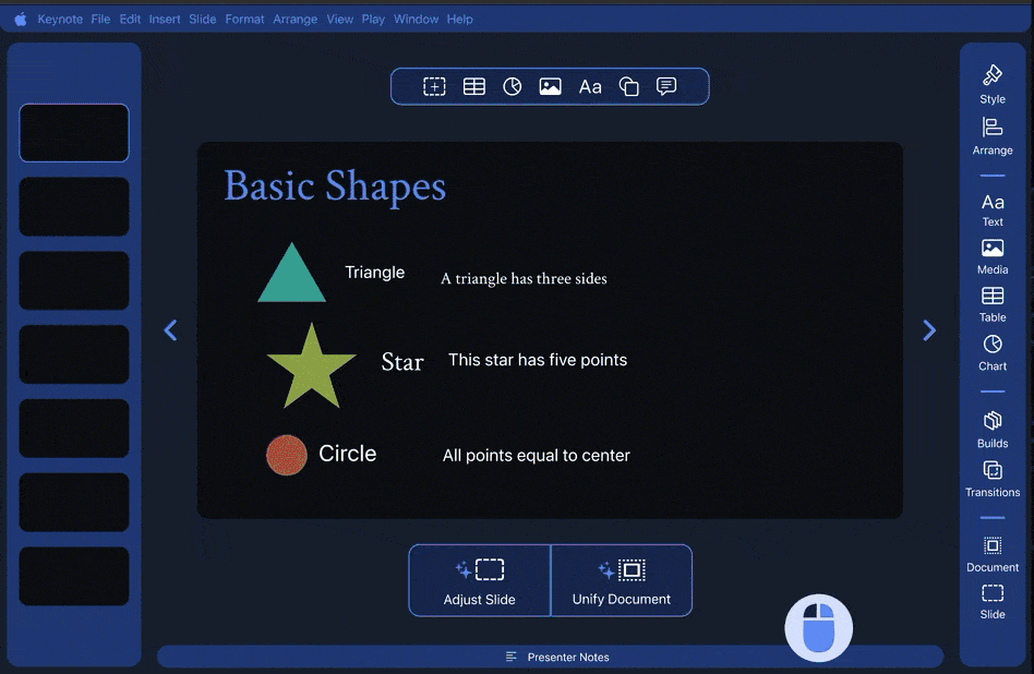
I developed an abstract version of the interface to keep the focus on workflows and feature utility rather than the Keynote interface. The prototype highlighted a reimagined UI and the integration of new AI features. Testing involved 20-minute in-person sessions with 5 participants, each representing one of the identified user archetypes.
Test Results
The Good
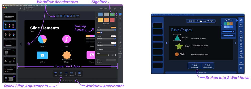
- Participants noted the extra space to work with the fly out panels collapsed
- Participants expressed better efficiency with the toolbar and presentation notes being in close proximity to the slide
- Participants expressed better efficiency with the next/previous slide navigation options
- Both designers and non-designers were enthusiastic about the AI options
Room to Improve
- Participants struggled to identify the right tool for what they were selecting on the slide
- Less design savvy Participants struggled to understand the slide adjustment options
- Participants desired a quick way to clean up slides, with more process intensive layouts being an additional option
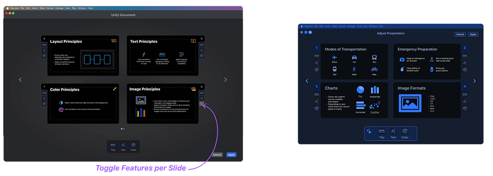
- Design savvy users wanted more control over what features to apply when unifying the presentations
Feedback to Refinement
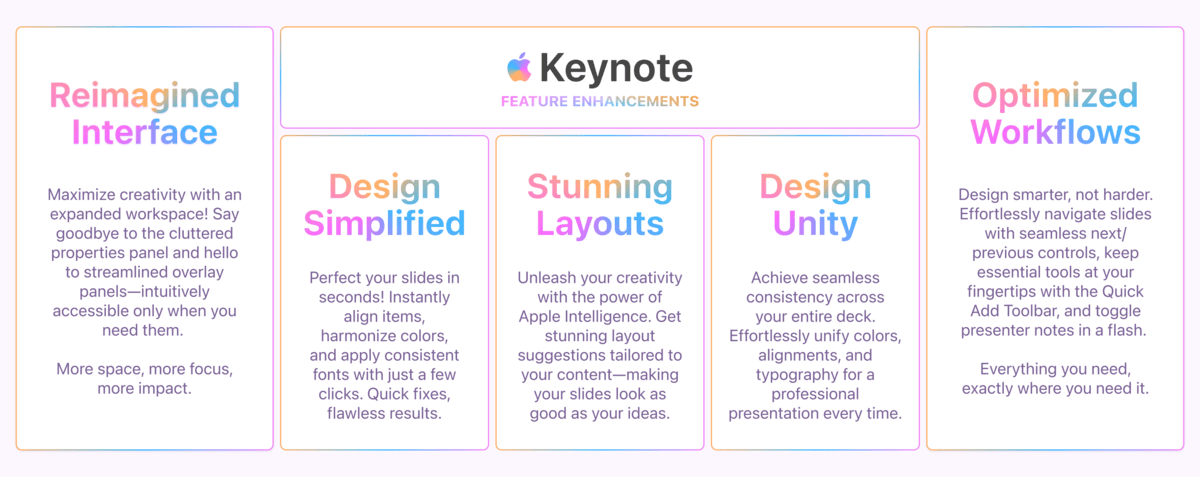
I incorporated the insights gained from the Heuristic Evaluation and Mid-Fidelity prototype testing into the High-Fidelity Prototype:
Main UI
Streamlined workflows and maximized workspace.
Layout Recommendations
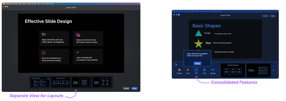
Slide level adjustments consolidated and separated into 2 workflows.
Unify Presentation
Control for users to toggle features at a slide level.
Design System
Atoms

Molecules
Organisms
Templates
